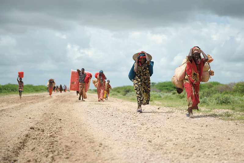
The 2025 SDG Report highlights a stark reality: only 35% of SDG targets show adequate progress, and just 18% are currently on track. At the same time, 18% of targets have regressed below their 2015 baseline levels. Some of the most concerning trends relate to SDG 2 on Zero Hunger, where close to 40% of targets have regressed, as well as SDG 14 on Life Below Water, SDG 8 on Decent Work and Economic Growth, SDG 10 on Reduced Inequalities, and SDG 13 on Climate Action.
The report also draws attention to shrinking resources for development financing, including for the statistical systems and data infrastructure needed to measure progress and understand what works. Yet, as the report notes, “tracking SDG progress and course-correcting in real time depends entirely on robust data infrastructure. […] Without reliable data, governments cannot identify problems early, allocate resources effectively or demonstrate accountability.” In this context, the world needs evidence that is available quickly, presented clearly, and designed to support action.
Over the past decade, 3ie has worked to strengthen the evidence infrastructure needed to support evidence-informed decision-making in low- and middle-income countries. The Development Evidence Portal is, by far, the largest repository of evidence on what works in low- and middle-income countries, bringing together more than 20,000 impact evaluations and over 1,700 systematic reviews to inform decision-makers and researchers working in international development.
As part of our efforts to help users explore this evidence in new and accessible ways, we have developed an interactive dashboard. The dashboard allows users to navigate the evidence by country, year, evaluation design, method, income level, democratic status, and fragile and conflict-affected status, enabling them to focus on the questions and contexts that matter most to them. This blog summarizes some of the key takeaways from the geographic navigation of this large body of evidence.
So, dear readers, as you dive into this interactive map of the spread of impact evaluation around the world, here are five things that may catch your attention.
1. The right place to start: wherever you work, there is at least some evidence
Impact evaluations are not concentrated in only a small number of countries or sectors. The question is no longer whether evidence exists, but how quickly we can find, understand, use, and produce the right evidence for the right decision. The dashboard visualizes more than 22,500 experimental and quasi-experimental impact evaluations published between 1990 and 2026, covering 129 low- and middle-income countries (L&MICs). This large number is encouraging, but let’s acknowledge the challenge: this is not always enough, as some evidence deserts persists. These deserts might be due to geographical, methodological, or sectoral gaps, meaning that some policy questions might still suffer from a lack of evidence.
2. Be optimistic: this evidence base is still growing
The growth of impact evaluations over the past three decades has been striking. In the early 2000s, fewer than 100 impact evaluations were published each year. By around 2015, annual publications had crossed the 1,000 mark, reaching a peak of about 2,400 studies in 2022. The period from 2015 to 2023 alone accounts for nearly 68% of all evaluations in the repository. Although this evolution is driven primarily by the growth of evidence from China (accounting for 21% of the evidence base), the trend remains even after excluding this outlier from the count.
3. From experimental to quasi-experimental approaches, the methods are diverse
The global evidence base is not built on one method alone. It brings together a wide range of approaches to measuring impact.Quasi-experimental designs account for just over half of the evaluations in the dashboard, while experimental designs account for slightly less than half. Randomized controlled trials remain the single most common method. The diversity matters. Different policy questions, contexts and data environments require different designs.
4. Yes, there is evidence everywhere… but it is uneven
The spread of impact evaluations is global, but it remains uneven across regions and countries. Sub-Saharan Africa has been one of the most extensively studied regions, with more than 7,000 evaluations. At the same time, East Asia and the Pacific have seen some of the fastest recent growth in the evidence base. However, the dashboard also highlights where important gaps remain. Regions such as the Middle East and North Africa, Central Asia, and many fragile and conflict-affected settings remain underrepresented. These gaps matter because they often correspond to contexts where decision-makers face some of the most urgent policy questions, but where rigorous evidence may be more difficult to produce.
A closer look at regional data also shows that, within continents, evidence tends to cluster around a relatively small number of countries. In Sub-Saharan Africa, for example, the evidence base ranges from only two studies in Mauritania to more than 900 in Kenya. Five countries (Kenya, Ethiopia, Uganda, South Africa, and Nigeria) account for around half of the region’s evidence base. Similar patterns can be seen elsewhere: China accounts for 70% of the evidence base in East Asia and the Pacific, while India represents 57% of the evidence base in South Asia. This country-level concentration shows that, despite the global expansion of impact evaluation evidence, growth remains geographically uneven. The evidence base is expanding, but not always in the places where it may be most needed.
5. Navigating a map is good; diving into the sea of evidence is better
The map is a gateway, not the destination. Its value is that it helps users see the global evidence landscape at a glance: where studies are concentrated, how the field has grown over time, which methods dominate, and which countries or contexts remain underrepresented. But each dot, filter and country count points back to something richer: the underlying evidence contained in the Development Evidence Portal. In this way, the dashboard is an invitation to move from orientation to exploration. Users can begin with the map, identify a country, region, method or evidence gap of interest, and then use the DEP to dive into the individual studies. In that sense, the dashblog is not just showing the spread of impact evaluation; it is helping users access the evidence that powers the map.
Conclusion
We all see the world through different eyes, and your exploration of the dashboard may reveal lessons beyond those highlighted here. For some, the key message will be the extraordinary growth of impact evaluation over the past two decades. For others, it will be the rise of China and East Asia in the evidence landscape. Others may focus on the persistent gaps in fragile and conflict-affected settings, or on the methodological diversity behind the global evidence base. Together, these lessons open new opportunities to strengthen impact in international development: by using existing evidence on what works, producing new evidence where gaps remain, and synthesising what has already been learned to make rigorous evidence easier to access, understand and apply.